PORTFOLIO CAPTURE
[ Launch Date: August 30th 2022 ]
In this article you’ll find:
- What is Portfolio Capture?
- Why use Portfolio Capture?
- Where do I locate Portfolio Capture?
- How does it work?
- How to customize Portfolio Capture
- The Details
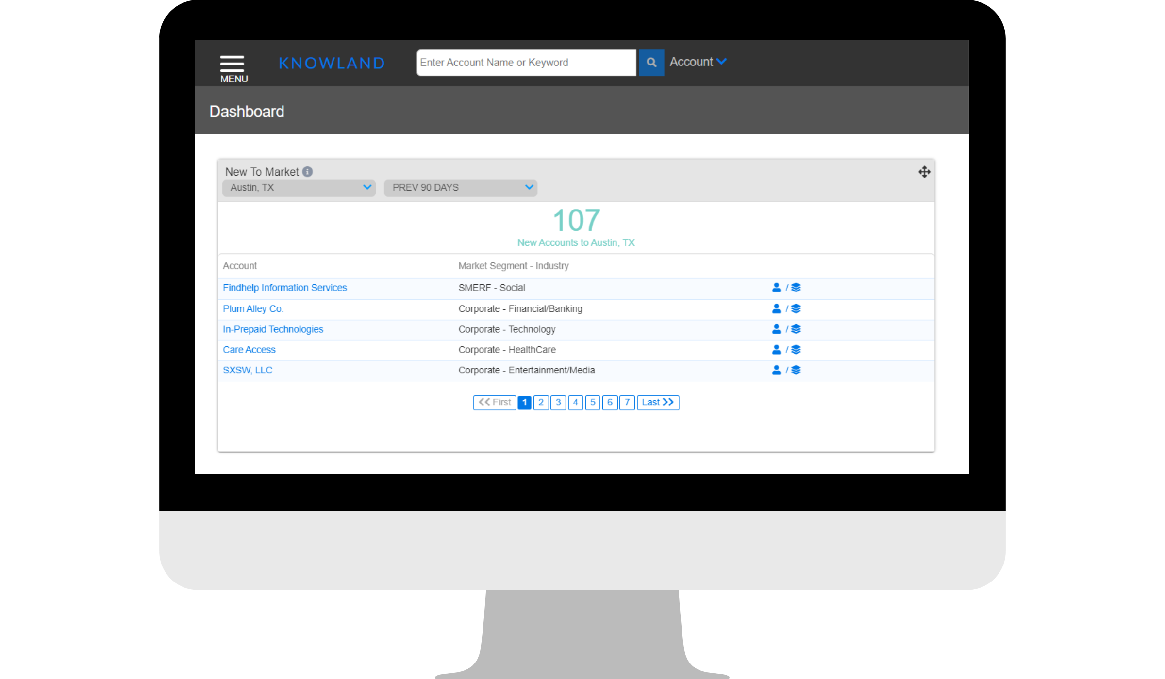
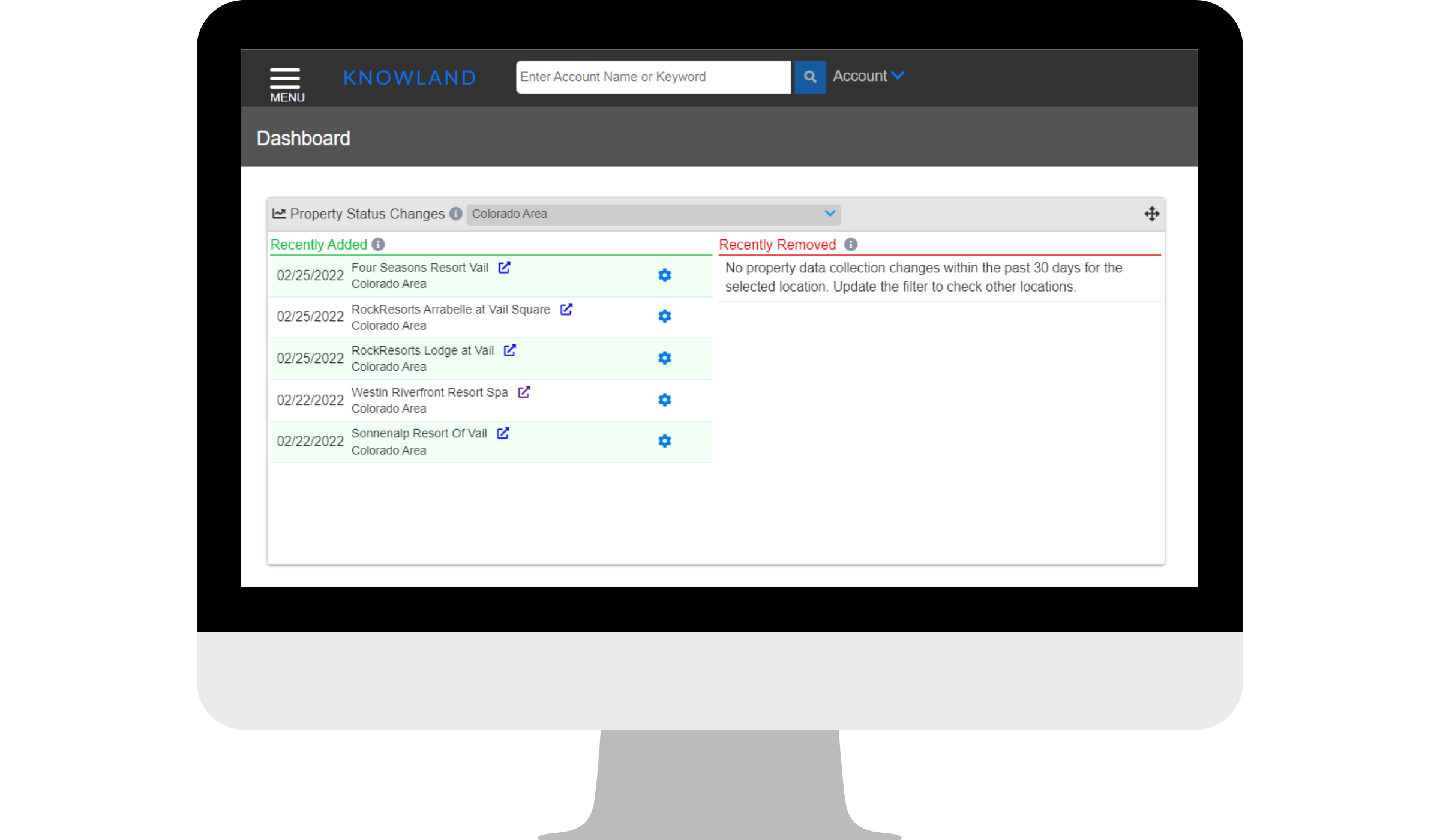
What is Portfolio Capture? Portfolio Capture is a comprehensive and unified view of your property portfolio’s group business capture, relative to the properties selected comp sets, and their markets of operation now and over time. This allows users to benchmark group performance in one easy to use dashboard.
Why use Portfolio Capture? Portfolio Capture makes it easy for leaders with multi-property responsibilities to benchmark their portfolio properties against each other, their chosen competitive sets, and their specific markets to maximize asset utilization, understand group market share trends, and improve sales efficiency across properties.
Where do I locate Portfolio Capture? To access Portfolio Capture, follow this path:
Menu > Analysis > Portfolio Capture
How does Portfolio Capture work? Portfolio Capture uses the data in the Knowland Platform to compare data points between two time periods. By default, it shows you the data for each portfolio property that is enabled for the tool over the last 30 days and the same date range in the year prior. The charts allow you to easily see, based on the data collected by Knowland, who are the top performers and Bottom Performers in Comp Set Capture, Market Capture, and Market Pace.
How to customize Portfolio Capture?
Selecting Date Ranges: By default, the page loads with the last 30 days as the Time Period and the same date range in the prior year as the Comparison. Users can select custom date ranges using the date picker. Simply click on the date range and a calendar will open allowing you to select the start and end date for the desired range. The same can be done for the Comparison date range.
Definitions:
- Time Period: The main period of data to be reviewed in the table.
- Comparison: The date range the user wants to compare performance against.
Selecting Portfolio Sets
By default, Portfolio Capture populates the table with information for all properties in the user’s portfolio that are enabled for Portfolio Capture. Users will see “All Properties” in the Portfolio Set field on the date picker tool.
If a user would like to create a custom Portfolio Set, they can do so using the Property Set Manager feature. A link to Property Set Manager is available on the date picker toolbar. Only properties that are enabled for Portfolio Capture can be added to a Portfolio Set. Users can create as many Portfolio Sets as needed and different users can have different Portfolio Sets.
To learn more about creating Portfolio Sets, visit this page.
Selecting Comp Sets
By default, Portfolio Capture assigns each Portfolio Property the user’s default comp set. During onboarding, the Implementation Team will create custom comp sets for each property that is enabled in Portfolio Capture.
Users can change or update the comp sets using the Property Set Manager tool. Click here to learn how.
The Details?
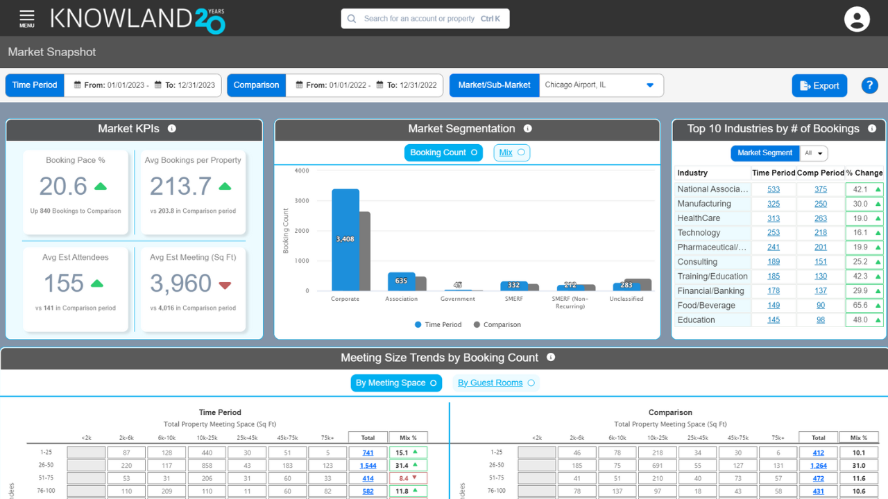
Comp Set Capture Chart:
The Comp Set Capture chart lists the three top or bottom-performing portfolio properties based on Comp Set Capture Percent for the selected Time Period.
The list of properties on the left is in descending order, highest to lowest, Comp Set Capture %. The colored circles, shades of blue from dark to light, mirror the highest to lowest order and represent the legend for the bars in the graph to the right of the property names.
On the right is a bar chart that displays the data for the top/bottom three properties in the list. The blue bars represent the Comp Set Capture % for the Time Period selected above, while the gray bars represent the Comparison Period the user selected. The data labels, in percentage, are for the Time Period date range. If you hover over the bars, a pop-up gives both data points and the color legend.
This chart lets users quickly identify which of their portfolio properties are performing the best/worst against their chosen comp sets.
Market Capture Chart:
The Market Capture chart lists the three top or bottom-performing portfolio properties based on Market Capture Percent for the selected Time Period.
The list of properties on the left is in descending order (highest to lowest) relative to Market Capture percentage. The colored circles, shades of blue from dark to light, mirror the highest to lowest order and represent the legend for the bars in the graph to the right of the property names.
On the right is a bar chart that displays the data for the top (bottom) three properties in the list. The blue bars represent the Market Capture percentage for the Time Period selected above, while the gray bars represent the Comparison Period the user selected. The data labels, in percentage, are for the Time Period date range. If you hover over the bars, a pop-up gives both data points and the color legend.
This chart lets users quickly identify which of their portfolio properties are performing the best/worst in their operating markets.
Market Pace Chart:
The Market Pace chart lists the three top or bottom growth Markets where the portfolio properties operate. The list is limited to the markets associated to the properties in the Portfolio Set selected by the user. The calculation for Market Pace is the percentage of change between Time Period and Comparison.
The list of markets on the left is in descending order (highest to lowest) relative to Market Pace. The colored circles, shades of blue dark to light, mirror the highest to lowest order and represent the legend for the bars in the graph to the right of the market names.
On the right is a bar chart which displays the data for the top/bottom three operating markets. The blue bars represent the Market Pace for the Time Period selected above. The data labels, in percentage, are for the percent change in bookings in Time Period from Comparison. Hover over the bars and a pop-up appears with only the percent change and the market, identical to the data label and the color legend.
This chart can be used to quickly identify which markets are growing or declining and compare property performance in those same time periods. Additionally, users can easily see if they have properties that have higher/lower growth than the Market Pace. Properties that have a lower growth rate than the market may need more attention, while properties outperforming their Market Pace may have some best practices that can be shared with other properties.
Data Table:
The data table lists all portfolio properties in the selected Portfolio Set in the rows, then the columns populate with data for the property, the comp set, and the market for the selected Time Period and Comparison period. In any of the “# of Accounts” columns, the users can see a Top 10 list of Accounts for that Portfolio Property in the same groupings, My Property, My Comp Set, My Market by clicking the number in that column.
The data table is divided into four parts: Property characteristics (White), My Property data (Purple), My Comp Set data (Blue), My Market data (Aqua).
Property Characteristics (White) is the list of properties in the selected Portfolio Set, their Comp Set (selectable), and the operating market of the property.
My Property (Purple) displays the data points for each Property for the Time Period selected. These columns include the Number of Accounts (# of Accts), Booking Count, Booking Variance, Comp Set Capture Percent, Comp Set Rank, Market Capture Percent, and Market Rank. The arrows designate the shift relative to the Comparison Period.
My Comp Set (Blue) displays the data points for each Property’s selected Comp Set and Time Period date range. The columns include the following: Number of Accounts (# of Accts), Booking Count, Booking Variance, and Average Property Market Capture Percent. The final section of the data table (My Market) displays the pertinent data points for each portfolio property’s market. These columns include the Number of Accounts (# of Accts), Booking Count, and Booking Variance.
Sorting Columns:
Each header (except for ranks), can be sorted alpha-numerically based on the KPIs users value most. For example, users can sort the report by the highest Comp Set Capture Percent or by the highest Booking Count.
Exporting To Excel: Users can export Portfolio Capture to Excel. The Export button is located on the top toolbar. NOTE: Exporting Portfolio Capture to Excel does not count toward the monthly allotted export limit for users with Limited Export packages.
For additional support, please email clientcare@knowland.com.